- Entertainment
- Style
- Lifestyle
- Food & Drinks
- Tech & Auto
- Culture
LUXURY, THESE DAYS, PREFERS TO WHISPER. IN A post-Succession world where stealth wealth has replaced hype culture and The Row has become shorthand for discernment—fashion has collectively decided that understatement is the new opulence. Monograms are out. Logos are shrinking. Loro Piana is having a cultural moment. Bottega Veneta has been logo-less longer than most people realise. And the loud flex? That’s been retired.
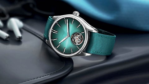
But long before fashion decided to stop shouting, watches had already mastered the art of coded luxury. The most expensive timepiece in the room has never needed to announce itself. Instead, it signals—to those who know—through subtleties: a bezel profile, a hand shape, a crown detail, a dial layout. The watch world has always spoken in design dialects. Quiet luxury didn’t arrive here. It simply found a home it already belonged to. In 2021, Swiss brand H. Moser & Cie. made headlines by doing the unthinkable: it erased its logo. The ‘Mega Cool’ watch arrived with an invisible brand name, turning the idea of overt identity on its head. It was equal parts satire and statement—a wink to an industry that had long communicated prestige without spelling it out. Because truth be told, watches have always operated on insider aesthetics.
A fluted bezel can be louder than a billboard. A blued hand can carry centuries of legacy. And a rectangular dial can dominate an entire category.
Take Breguet. The house of Abraham-Louis Breguet didn’t just invent complications; it invented an aesthetic code. The iconic Breguet hands—open-tipped, heat-blued steel—are arguably the original quiet flex. Born from a blend of function and artistry, these hands weren’t decorative indulgences but technical feats, achieved by heating steel until it turned a perfect cornflower blue.
Today, countless brands borrow the silhouette. But no one does it like Breguet. Spot those hands across a room and you know exactly what you’re looking at. It’s the Savile Row lapel of watchmaking.
Then there’s Rolex, a brand that didn’t just build watches—it built visual dominance. The fluted bezel began as a functional solution for waterproofing. Over time, it transformed into a piece of jewellery, a shimmering signifier of status. The Pepsi bezel, originally designed for pilots who needed to distinguish day from night, has become a pop-culture icon. Together, these design elements are so deeply encoded into collective taste that even their imitators signal legitimacy. From Tudor to TAG Heuer, from Tissot to Seiko and countless microbrands, the influence is everywhere.

If Rolex wrote the language of modern status, Cartier wrote the poetry. In 1917, the maison introduced the Tank, inspired by the silhouette of military tanks seen from above during World War I. It was a rebellion against round cases, a geometric manifesto wrapped in Roman numerals and a chemin de fer minute track.
Add the blue cabochon crown—a tiny jewel that became a signature—and you have one of the most influential designs in watch history. The Tank didn’t just become a model; it became a genre. So much so that “Tank” is now a term other brands use in homage.
And then came Gerald Genta, the man who quietly redesigned the future. In the 1970s, he gave us the Audemars Piguet Royal Oak, followed by the Patek Philippe Nautilus—steel sports watches that cost as much as gold dress pieces. It was heresy at the time. It is gospel now. Genta effectively invented the luxury sports watch category, a genre that dominates both resale culture and modern taste. His influence runs so deep that even brands outside his portfolio—from Bvlgari to IWC—borrow from his playbook. Today, the Gerald Genta brand, run by his family, is rummaging through archives to resurrect his legacy. Every steel watch that costs as much as a car owes a silent thank-you to him.
Panerai perfected the art of being uncopiable. Its cushion case, sandwich dial and crown guard weren’t aesthetic flourishes—they were born from military necessity for Italian naval divers. But together, they formed a design language so specific that copying it feels almost illegal. These details have survived trend cycles, size wars and aesthetic revolutions. No brand dares to replicate them.
Not all quiet luxury wears a five-figure price tag. Enter Casio. The digital display—born in the techno-optimism of the 1970s and ’80s—has become one of the most recognisable watch signatures on the planet. From streetwear kids to CEOs, from Gen Z TikTokers to nostalgic collectors, the humble Casio digital is a cultural constant. It’s anti-luxury luxury. A reminder that iconic design doesn’t require precious metals, only permanence.
Then there’s Breitling’s Navitimer, a masterclass in functional beauty. Designed for pilots, its dial layout—with railroad numerals and a slide-rule bezel—was meant to compute fuel consumption, flight time and distance. It was a cockpit instrument disguised as a wristwatch. Today, its aesthetic DNA lives on in countless tool watches that borrow its legibility-first philosophy.
Beyond these archetypes, the design codes keep multiplying. Vacheron Constantin’s Maltese cross lugs. Longines’ sector dials and heritage typography. Omega’s asymmetrical Speedmaster case and lyre lugs. Rado’s ceramic futurism. Bvlgari’s ultra-thin Octo Finissimo silhouette. None of them need a logo to announce themselves. Their shapes do the talking.
That’s the real lesson of quiet time. In an era obsessed with visibility, the most luxurious watches are opting out. They don’t need branding or validation. Their identity lives in a hand shape, a bezel, a crown detail. Because the best design doesn’t scream. It signals.