
- Entertainment
- Style
- Lifestyle
- Food & Drinks
- Tech & Auto
- Culture
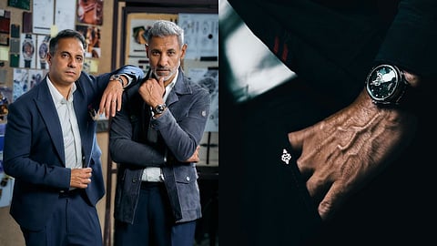
Ask a fashion designer what he has brought to a watch and the answer ought to go further than a name on the strap. With Shantnu & Nikhil's take on the ROTORIS Manifesta Pietersite, the interesting part is how they describe shrinking the language of clothes to wrist size. Its made exclusively with only 500 pieces and priced at ₹1,33,000. Texture becomes stone. Drape becomes the softness of a lug. The palette stays deep and difficult to pin down. Their starting point is less about what a watch should announce than how it should feel alongside everything else you wear.
"Everything that you see on the watch has been sat down, spoken about, and created together," says Nikhil. He describes a bottom-up process involving decisions about the dial's size and the stone itself. It is a useful distinction for a collaboration between a watch brand and couturiers: the designers say their involvement began with the object, rather than the accessories surrounding it. The question, then, is whether their choices amount to a recognisable point of view. Their answer starts with a slice of Pietersite.

For Nikhil, the stone's appeal lies in its relationship to the clothes they already make. "And it's also because of the texture that you see on it, which is very similar to the textures we do in our menswear clothing," he says. He talks about slate grey, black and a natural feel, without loud embroidery. In that reading, the dial is doing the work a textured fabric might do in a jacket: giving the eye something to discover without demanding the whole room's attention.
Shantnu describes the stone as matte, a quality that, he says, allowed them to use gold above it. The contrast is the point. Rather than treating every surface as an opportunity for shine, the designers wanted one element to make space for another. "So every dial that we've done is defined by the stone that's in it as well, and the colour, the sheen," he says. It is a conversation about proportion and finish, the sort you might expect around a garment, transferred to a much smaller canvas.
The irregularity matters too. Nikhil says they watched the slices emerge, each with a different sense of reflection and depth. "That is the couture value that we brought in," he says of the differences between dials. The comparison is about individual variation, rather than a claim that the watch is bespoke. A numbered edition can still repeat a design; the stone, in the designers' telling, makes each version slightly different within it.
There were other stones in contention, although Nikhil makes the final attraction sound instinctive. He compares it to choosing someone to marry, rather than weighing up an endless line of alternatives. Shantnu is more interested in the work behind that instinct: choosing, curating and seeing how a stone looks once cut. "We went through this arduous, yet beautiful process. Finally, we came to Pietersite," he says. Between them, the romance gets a little practical explanation.
That same thinking carries into the straps. Nikhil describes a "textured-skin finish", emphasising tight grain and the character he wants the material to acquire through wear. He imagines the strap becoming deeper and darker with use, collecting something of its wearer's life along the way. It is a romantic brief for a practical component, and one that makes surface matter as much as colour.
The colours he discusses are dark chocolate, deep emerald and slate black; Shantnu calls them "deeper, inky palettes". Nikhil puts the ambition neatly: "We wanted to give vintage palettes which feel very contemporary." It is a more useful way of understanding the collaboration than trying to match every shade to a specific outfit. The proposed mood is rich, subdued and familiar without being literal.
Nor do the brothers tie the watch to one collection. They talk instead about gathering the emotions of their work and translating the house codes. Texture belongs in the strap and dial. Softness, associated with a drape in clothing, finds its counterpart at the sides of the lugs. This is where the collaboration becomes most interesting: an Indian fashion house explaining its identity through material and shape, without needing a garment to do the talking.
The watch vocabulary has not disappeared beneath the fashion conversation. The Manifesta has an open-heart display at six o'clock, making the movement visible through the dial. ROTORIS identifies the movement powering the range as the Japanese Miyota 82S0. That is an important separation: the Indian design story is not a claim to an Indian-made movement. Here, the brothers' contribution is best understood in the choices they discuss, from the stone's character to the relationship between the dial and the strap.
Asked what to wear it with, Nikhil points to the shacket Shantnu is wearing and his own suit. The suggestion is breadth rather than a rulebook. It makes the conversation about getting dressed, rather than dressing up: a small distinction, but one that gives the watch more room. "Particularly, this is a watch of an emotion, not of an occasion," he says. Strip away the phrasing and there is a sensible styling proposition underneath: choose it because its texture and palette belong in your wardrobe, rather than save it for an invitation with the correct dress code.
Shantnu also describes the sizing as unisex, connecting it to the label's interest in androgyny. That broadens the conversation beyond the man in a suit, even if menswear supplies much of the design vocabulary. Proportion becomes a personal choice, rather than a fixed instruction about who gets to wear which watch.
He says the collaboration follows ROTORIS's numbered-series approach and is strictly limited. But there is a distinction between rarity and individuality. A number tells you where a watch sits in a production run; the designers are asking you to care about the stone, the texture and the relationship it might develop with your clothes.
It is a sentiment echoed from the brand's side. As ROTORIS co-founder Prerna Gupta notes about the collaboration, a Manifesta dial "begins with something nature makes only once", in a deliberate attempt to let natural irregularity, rather than sheer scarcity, define the piece. For a couture collaboration, that is the stronger argument. The signature worth looking for is a way of seeing, rather than simply a logo on the dial.